Ever notice how subscribing to meal deliveries like Blue Apron or Freshly is not a typical ‘add to cart’ experience?
Do you know why the top brands in the Meal Box Subscription space do it differently?
They are changing the typical signup experience because with total control of the customer journey they can wow customers and maximize conversions.
Have you launched your own Box Subscription site and want to learn how you can design and develop your own unique customer experience, so you too can wow customers and drive more conversions?
In this post, we not only break down and compare a few of the biggest brands in the space – HelloFresh, Blue Apron, Daily Harvest and Freshly, and how each has a uniquely designed customer journey – but we show how you can do it yourself.
You’ll find a complete step-by-step guide to building your own fully customizable meal box subscription site using WooCommerce and the Autoship Cloud powered by QPilot plugin, so you can steal the secret sauce they’re using.
How the Current Market Leaders Do It
When it comes to Meal Box Subscription leads, there are several different approaches to how they manage the customer journey.
Each attempts to make ordering easy and conversion turnkey, but each is limited to the technology they use and the experience they have.
This is how the current leaders approach the customer journey:

- Step 1: Select Box Size
- Step 2: Always Weekly
- Step 3: Register
- Step 4: Checkout
- Step 5: Select Meals
- Step 1: Register
- Step 2: Select Box Size
- Step 3: Always Weekly
- Step 4: Choose Delivery Date
- Step 5: Select Meals
- Step 6: Checkout

- Step 1: Register
- Step 2: Select Box Size
- Step 3: Weekly or Monthly
- Step 4: Select Meals
- Step 5: Checkout

- Step 1: Register
- Step 2: Select Box Size
- Step 3: Always Weekly
- Step 4: Checkout
- Step 5: Select Meals
It is interesting to note that Hello Fresh requires visitors to select a box size at the beginning, while the others require visitors to register their email. Why the difference?
Hello Fresh wants potential customers to experience the beginning of the subscription process by selecting the type of box and size they want. This gets users interested, but still requires an email to proceed.
Anyone that registers has selected an option, so remarketing efforts can be more targeted.
Freshly, Daily Harvest, and Blue Apron put the box size second. If a visitor is interested enough to explore the site, then they must give an email address to start.
This allows for email remarketing for anyone that doesn’t complete checkout.
While Hello Fresh puts box selection at the front, each of the other sites put it second. This also captures buyer intent, but also makes it easier from a technical standpoint.
Brands can control the customer journey but make it easier on themselves by making the purchasing process a series of steps.
For example, depending on the box size selected makes different meal options available, as well as quantity. Controlling these options makes it easier to develop and offer an effective purchasing experience.
Only two of the sites do checkout at the end like other typical ecommerce experiences: Freshly and Daily Harvest. The others put meal selection at the very last, because you actually schedule a time in the future for your order to process.
That last step – to process at checkout or schedule it for later – is something we break down especially later.
All About the Ingredients
How would you craft the perfect journey for your customers? What ingredients would you include for your secret sauce?
We’ve built out two sites that capture the best of what the big brands are doing, and included very detailed guides so you can not only see how we did it – but see how to do it yourself!
One site has a checkout at the end, and the other doesn’t. You decide which makes the most sense for your brand, and why.
- Step 1: Register
- Step 2: Select Box Size
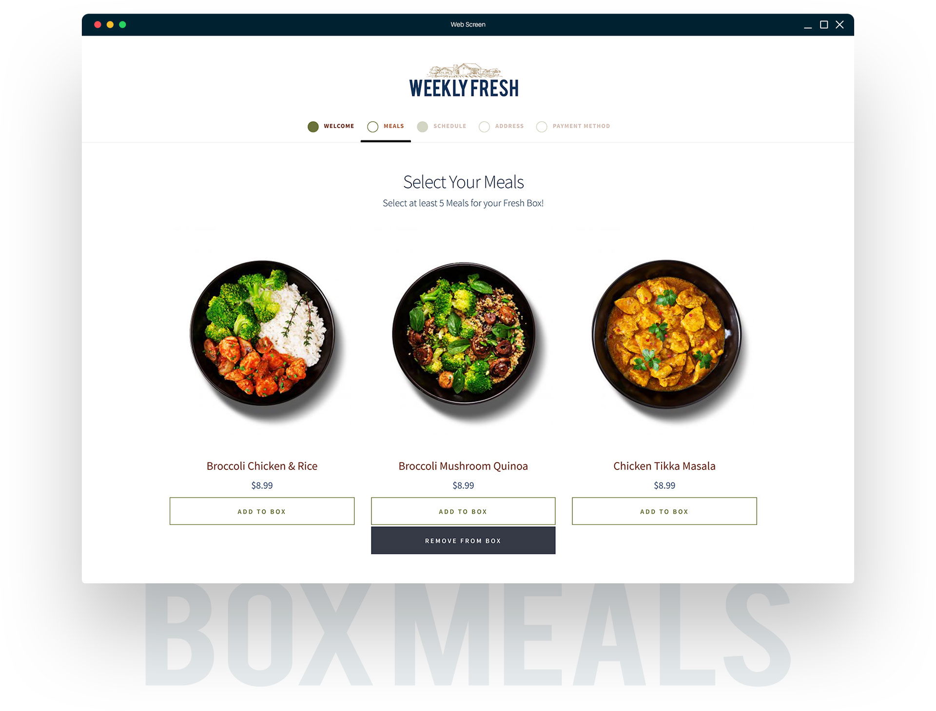
- Step 3: Select Meals
- Step 4: Select Schedule
- Step 5: Enter Address Info
- Step 6: Enter Payment Method
- Step 7: Place Order
weeklyfresh.co
Our Non-Checkout Customer Journey
Our customer journey that includes walking a customer through everything you need to create a meal subscription, from registration, to meal selection, entering shipping information, even adding a saved payment method to be charged later, all without the need for a checkout!
checkout.weeklyfresh.co
Our Checkout Customer Journey
Our second customer journey that includes walking a customer through registration, choosing a box size, selecting meals, and even picking a delivery schedule, all finishing with sending the customer through placing the order at checkout.
- Step 1: Register
- Step 2: Select Box Size
- Step 3: Select Meals
- Step 4: Select Schedule
- Step 5: Checkout
How-to design and develop
A Meal Box Subscription site without a checkout: weeklyfresh.co
Get Started or Select a Step:
How-to design and develop
A Meal Box Subscription site with a checkout: checkout.weeklyfresh.co
Full Step by Step Tutorial Coming Soon!
Step 1: Box Sizes and Delivery Schedules
Step 2: Designing the Customer Journey
Step 3: Cart Requirements
Step 4: Using the Checkout to create the Scheduled Order
Step 5: Beyond the Checkout – Controlling Future Deliveries
Learn how the Autoship Cloud plugin can improve the customer journey on your site. Drive more conversions on repeat customers and scale your business with a tool built to be flexible and reliable. Find out how by speaking with a member from our team today.
